Thursday, 16 May 2013

FMP Update


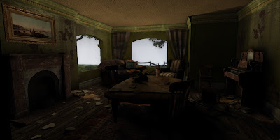
I've changed the lighitng in the living room area. Before there were large patches patches of darkness which i struggled to fix by changing the number of bounce lights and global illumination. Instead I moved and added candles to brighten up areas. It also gives a nice gradient of colour from left to right

Planes of light have also been added to give a dusty, inhabited feel to the level


I also added a broken wall piece and modelled a brick reusing texture space from the tiling texture. Adding this mesh makes the broken wall piece more convincing


More broken wall pieces, creating a derelict, overgrown feel to the interior. 


I wasn't too happy with the hallway as it wasn't that interesting. I've made it a little more dynamic by adding ivy which has made it's way into the house


Apart from general tweeking and adding assets another change is to the fire outside. It's colour was too yellow but has now been made a little more red. 

Tuesday, 14 May 2013

FMP Progress

Haven't posted a blog for a while. Most up to date screenshots so far..


Exterior. Pretty much unchanged, added my own skybox the environment. There is also a very light rain


Hallway. There are now candles adding light to the house. I also faked some of the lighting by adding more lights to highlight the chair etc.


View from upstairs down


I also modelled another vehicle. Adding a start to the level, the player exits his car to explore the house. the lights are left on illuminating the shadowed areas of the house

Monday, 29 April 2013

FMP Progress

I've been working on the exterior to make it look complete and an actual playable level.


Area around the outside of the house. I made some bars of wood (re using texture space) and placed around the house blocking up windows, burning in the barrel and leaning against walls. Just like the interior is very cluttered, i wanted a similar feel in the front yard.


A small vista has been added also. As the house is a modular tileset, it meant i could easily replicate other houses in the area. I was also basing this environment from a scene from 'Shutter Island'


I also finally got around to finishing the roof. I made a few tiles using the texture from the slates i'd already made, then simply placed them accordingly. 

Monday, 22 April 2013

Ivy

I've decided to devote my time to developing the exterior of the house. Making the house seem delapatated, unkempt and derelict, I made some ivy branches to take over the exterior of the house. 


The method to create the vines is essentually the same process making the trees. Making a high poly leaf, attaching to a branch using the object paint tools in max and then baking down various maps to a plane.

I made 4 variations to ensure it never seemed repeated.


Vines as they appear on the house.

 I didn't want to densely populate the exterior, but have areas of concentration where nature has consumed the building. 

Monday, 15 April 2013

FMP Progress

Haven't posted a blog in a while so this update should show a fair amount of progress. The past couple of weeks or so I've been working on my asset creation to populate the house making it more interesting.


In hindsight I probably spent a bit too much time on a couple of these assets. Particularly the Box of matches which is a high-poly model baked down to a slopped plane in the box. (but I don't care it looks good)


Most of my time has been spent working on the living room as it was pretty much empty before. I've been using the cloth modifier (a lot) to enhance various assets. Curtains and draped over sofa's etc. As the modifier needs a very high poly base mesh to work correctly, I had to retopologise to create an acceptable mesh with a reasonable tri count.


On the left is the high poly version which is over 50,000 tris, on the right is the low poly version which is almost identicle using just over 600 tris. 


Wires from the two versions. Dramatic difference between the two. There were a couple of minor errors from the bake but these were fixed in Photoshop using a dust and scratches filter on a duplicated layer then masking out the errors.

Monday, 25 March 2013

Interior Progress

Carrying on the development of the interior I've made a few more assets and decals to add to the hallway area.

The decals/assets help to break up the tileable textures on the walls & floor whilst adding to the derelict feel of the house. I've tried to re-use texture space as much as possible so the broken tiles use a combination of materials from the white wall and the roof tile.


I plan to use these decals and materials throughout the rest of the level to achieve the abandoned/derelict feel I am going for.

Wednesday, 20 March 2013

Interior Progress

Recently I've started to put time into the interior of the building producing various textures for the walls and developing decals to place around the house to make it seem derelict.


This is the end of the corridor to where you find the stairway. The texture on the walls is pretty basic broken up by decals to add variety and interest to the level.


origionally i wasn't too happy with how the brick appeared on the wall as there was no shadow cast from the overhanging wall paper. To correct this i simply hand painted on the difuse where shadows would be cast.

A new texture sheet had to be made for the difuse, but still uses the origonal normal map with texturecoordinate nodes so it tiles correctly. 

I still need to make more decal variations for the brick and wall paper cracks.